
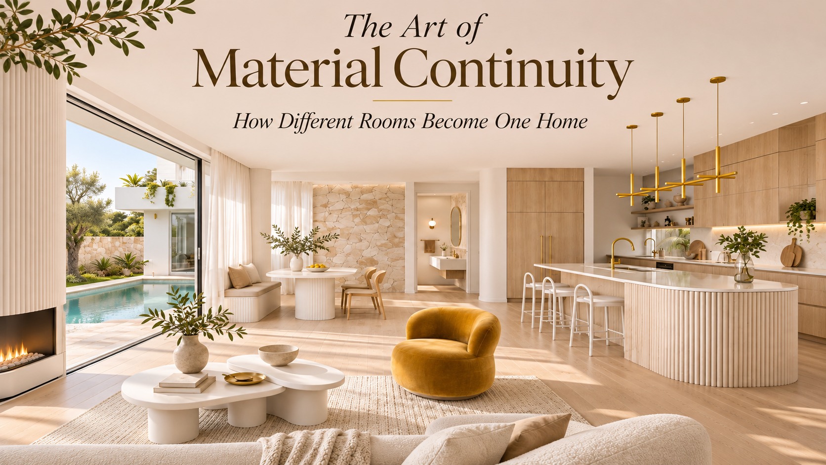
A beautifully designed kitchen does not necessarily create a beautifully designed home.
The kitchen may have warm oak cabinetry and a carefully selected stone benchtop. The living room might feature an elegant sofa, a neutral rug and thoughtfully chosen furniture. The bathroom may have its own sophisticated palette of tiles and brushed metal.
Individually, every room works.
Yet walking from one space to another can still feel strangely disjointed.
The problem may not be any particular product, colour or piece of furniture. It may lie in the relationships between them.
Good residential design is not simply about creating a series of attractive rooms. It is also about understanding how those rooms belong to the same home.
This is where material continuity becomes important.
Material continuity is the deliberate use and coordination of surfaces, textures, colours and finishes to create a coherent spatial experience. It does not require identical materials everywhere. Rather, it establishes relationships that remain recognisable as people move through the home.
The result is not necessarily a uniform interior. At its best, it is a home that feels considered as a whole.
Materials, contrast and visual continuity
Floors, lighting and transitions
Applying material continuity across rooms
Why Beautiful Rooms Sometimes Feel Disconnected
Many homes are decorated room by room.
The kitchen receives attention during a renovation. The bathroom is updated a few years later. Furniture is replaced gradually. Wall colours change as tastes evolve.
This is a perfectly normal way for a home to develop.
But it also means that individual decisions may be made without considering the surrounding spaces.
Imagine a house with cool grey kitchen tiles, warm honey-coloured flooring through the living area and a strongly patterned hallway floor.
None of these finishes is necessarily unattractive.
The difficulty appears at the transitions.
Where the materials meet, the eye registers changes in colour temperature, pattern, texture and direction. When too many changes occur without a clear relationship, the home can begin to feel fragmented.
The solution is not always to replace the finishes.
Sometimes a repeated colour, a shared timber tone or a carefully selected transitional detail is enough to create a stronger relationship.
Continuity is therefore less about making everything match than about making design decisions feel connected.
The Eye Reads Relationships Before Individual Materials
When entering a room, people do not experience every finish in isolation.
They see larger relationships: the floor beneath the furniture, the wall behind the cabinetry, the way daylight reaches a surface and the repetition of colours across the space.
A timber floor may visually connect a hallway with an adjoining living room.
A stone benchtop may share a warm undertone with nearby wall tiles.
A dark metal detail may appear in a pendant light, a cabinet handle and a window frame.
These relationships create a visual rhythm.
Not every repeated detail needs to be obvious. In fact, subtle relationships are often more effective than exact duplication.
A warm-toned timber cabinet does not require an identical timber dining table.
Materials can belong to the same visual family without having the same grain, species or finish.
The important question is whether they support one another or compete for attention.
Repetition Creates Recognition
Repeating a material can help establish continuity, particularly across connected spaces.
For example, timber flooring that continues from the entrance into the living and dining areas can make those rooms feel part of a larger composition.
Similarly, repeating a restrained metal finish across several architectural details can create an underlying sense of order.
But repetition becomes less useful when it turns into excessive matching.
A room where the floor, table, cabinets and decorative objects all use nearly identical timber finishes may lack depth.
Good continuity leaves room for variation.
Contrast Creates Definition
Contrast is not the opposite of continuity.
It can be an essential part of it.
A darker kitchen island against light cabinetry can establish a focal point without disrupting the surrounding interior.
A textured stone surface can add weight to a room dominated by smooth finishes.
A contrasting floor material can signal the transition from one functional space to another.
The important distinction is between intentional contrast and unrelated change.
Contrast works best when it has a role: defining a zone, emphasising an architectural feature or creating balance.
When Two Expressive Materials Share the Same Space
Natural stone and timber can create a compelling combination, but both materials may carry strong visual information.
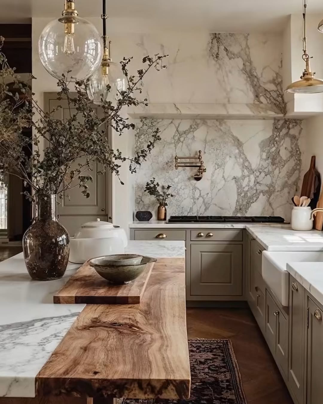
In the kitchen shown here, the stone backsplash and benchtops feature prominent veining, while the timber island introduces irregular grain, natural tonal variation and a more tactile appearance.
The composition works through contrast rather than exact material matching.
Muted cabinet fronts provide a quieter background, allowing the more expressive surfaces to remain distinct.
This reveals an important principle of material continuity: materials do not need to look alike, but their visual intensity should be considered together.
When several highly patterned surfaces compete for attention, the room can become visually unsettled. Providing calmer areas between them can help create hierarchy and balance.
Flooring Is Often the Strongest Connecting Element
Among the surfaces in a home, the floor is one of the most visually continuous.
It runs beneath furniture, extends through doorways and shapes how spaces relate to each other.
This makes flooring transitions particularly important.
In an open-plan home, using one floor finish across the kitchen, dining and living areas can create a sense of visual expansion.
The absence of unnecessary material breaks allows the eye to travel across the space more freely.
However, continuous flooring is not automatically the right choice for every part of a home.
Different rooms have different requirements.
A bathroom floor must be assessed for its wet-area construction, moisture exposure and appropriate surface performance. A kitchen requires practical consideration of cleaning, spills and everyday wear. Bedrooms may benefit from different acoustic or tactile qualities.
The design challenge is to coordinate these requirements without making transitions feel arbitrary.
A Continuous Floor Can Support a More Expressive Wall
A material does not need to cover the largest surface to become the most noticeable feature.
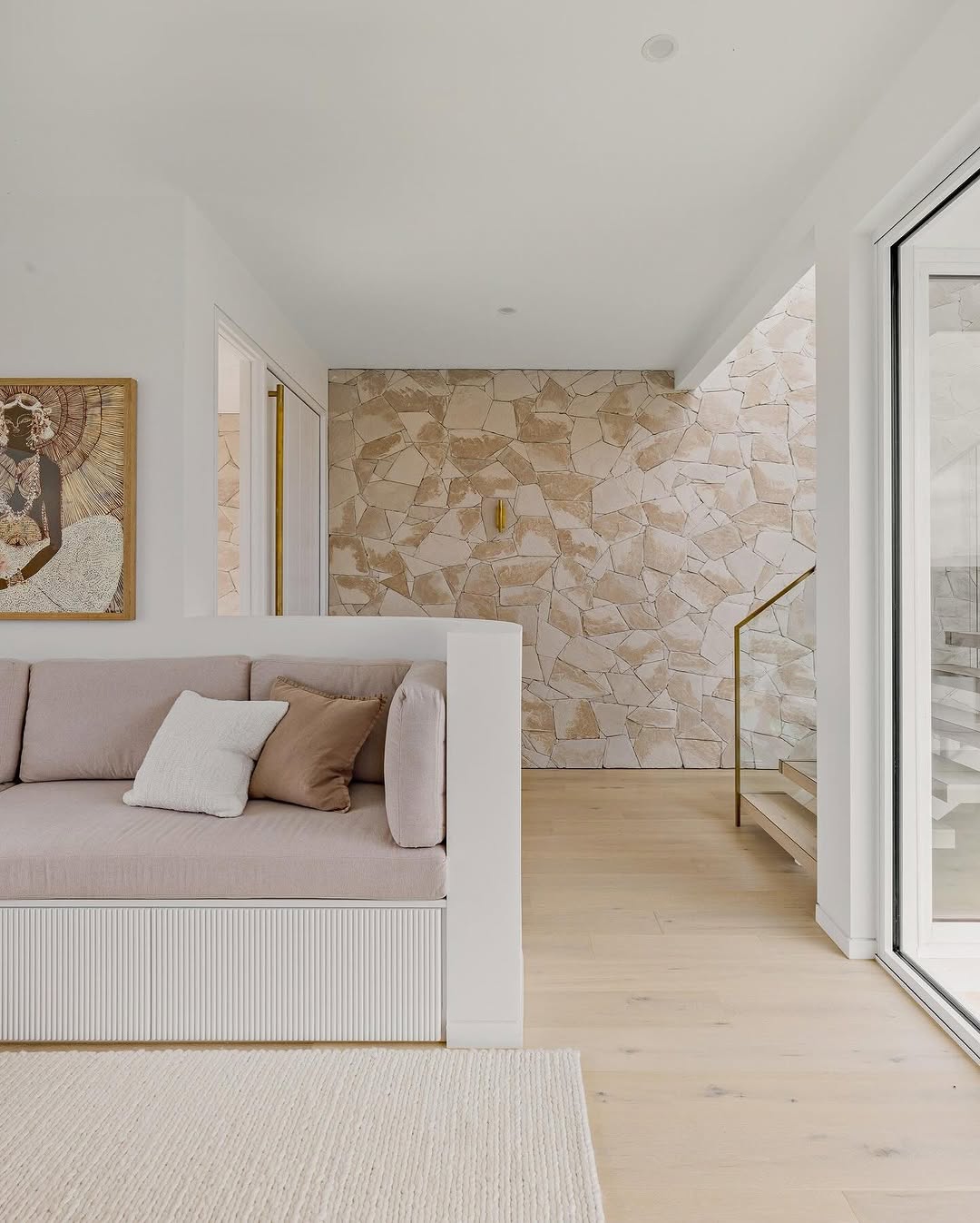
In this interior, the irregular stone wall introduces strong texture and variation. Its edges and individual pieces create an expressive architectural surface.
The pale timber floor performs a different role.
Rather than competing with the stone, it provides a more consistent visual plane connecting the seating area, hallway and adjoining architectural elements.
The contrast between the textured wall and the quieter floor gives each material a clear purpose.
This is one way material continuity can work without repeating the same finish everywhere: one surface provides character, while another establishes connection.
A Material Transition Should Have a Reason
A change of flooring can occur at a doorway, a threshold or another meaningful architectural boundary.
For example, a timber-look floor in a hallway may meet a tiled bathroom floor at the doorway.
If the transition is cleanly detailed and the colour relationship is considered, the materials can feel connected despite being different.
Problems are more likely when material changes occur in visually awkward locations or when the transition itself becomes unnecessarily prominent.
The technical detail matters too.
Different flooring systems may have different thicknesses, movement requirements and substrate conditions. The junction needs to work physically as well as visually.
Where a design includes wet areas, the selected floor finish must be coordinated with the appropriate waterproofing and construction system.
For deeper technical discussion, our guide to choosing bathroom floor tiles in New Zealand examines the relationship between surface finish, wet-area performance and the underlying floor assembly.
Colour Continuity Is More Than Using the Same Paint
A cohesive home does not need one wall colour throughout.
Instead, it can use a controlled family of colours that responds to light, materials and room function.
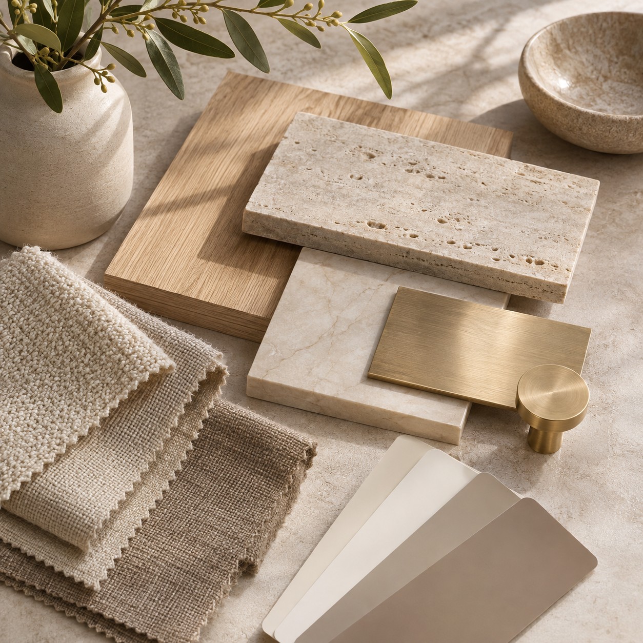
Consider warm white walls, soft taupe upholstery, natural oak joinery and pale stone surfaces.
These finishes are not identical, yet they may share compatible undertones and create a coherent atmosphere.
By contrast, two products both described as beige may look surprisingly different when placed together.
One may lean towards pink; another towards yellow or grey.
These differences become more noticeable where materials meet directly.
Work With Fixed Elements First
Some interior elements are easier to change than others.
Paint, textiles and removable accessories can usually be updated more readily than flooring, built-in cabinetry or a stone benchtop.
For this reason, a long-term colour scheme should consider the more permanent materials first.
A home's flooring, major joinery and fixed surfaces create a useful foundation for later choices.
Our existing article on building a colour palette around fixed elements explores this relationship.
However, a colour palette alone cannot guarantee spatial continuity.
The way colours appear under different lighting conditions also matters.
Light Changes the Way Materials Relate
Two rooms can use the same materials and still feel noticeably different.
One may receive strong daylight through a large window. Another may rely mainly on artificial lighting.
Timber, stone, paint and textiles can appear warmer, cooler, lighter or darker as their illumination changes.
Texture also responds to the direction of light.
A deeply grained timber surface may become more visually pronounced under directional lighting. A matte wall may appear softer, while polished surfaces can create stronger reflections.
These differences are part of the character of a home.
The aim should not be to make every room appear identical under every condition.
Instead, materials can be selected and coordinated with an understanding of how the rooms are actually lit.
Samples Need to Be Seen Together
A sample selected in isolation may look entirely different beside the surrounding finishes.
Where possible, review material samples together in the room where they will be used.
Place flooring samples beside cabinetry finishes. Compare stone against the intended wall colour. Observe how the combinations change during the day and under the planned evening lighting.
This is more informative than choosing each material from a separate screen or catalogue.
Photographs can help communicate direction, but they cannot reliably reproduce every surface texture, colour or lighting condition.
The Kitchen, Dining Area and Living Room Should Have a Conversation
Open-plan living brings multiple functions into one visual field.
Cooking, eating, relaxing and socialising may happen in separate zones, but those zones are experienced together.
This creates opportunities for material continuity.
A kitchen island can establish one of the strongest architectural forms in the space.
Its colour, surface and proportions influence how the dining and living areas are perceived.
But the dining table does not need to match the island exactly.
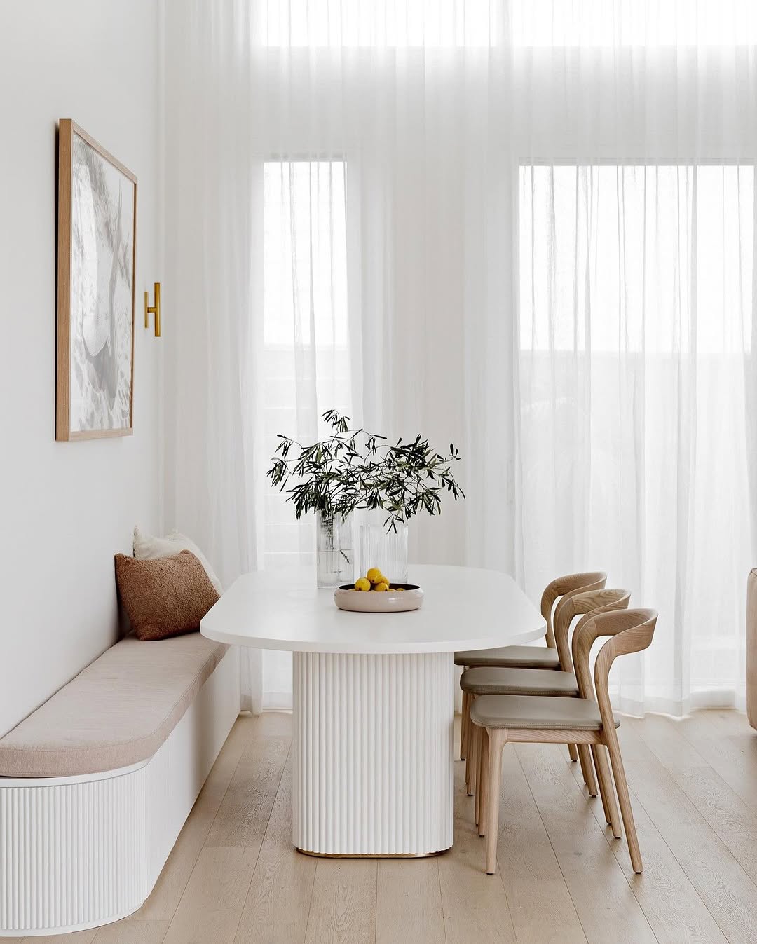
A timber dining table may introduce warmth against stone kitchen surfaces. A soft upholstered dining chair can connect with the textures used in the living room.
This creates a relationship through contrast and repetition rather than duplication.
Furniture Can Bridge Architectural Materials
Furniture is often the most flexible part of a home's material composition.
A rug can soften the transition between hard flooring and upholstered seating.
A sideboard can repeat the timber tone of kitchen cabinetry without copying its design.
A sofa can introduce a quieter neutral that balances more expressive architectural finishes.
Furniture arrangement also influences the way these materials are seen.
A dining table placed along a clear visual axis can strengthen the connection between the kitchen and living space.
A poorly positioned large sofa can interrupt that relationship.
Our feature on how seating layout shapes the way a home is used explores how furniture arrangement affects movement and everyday behaviour.
Private Rooms Can Be Different Without Feeling Unrelated
Bedrooms and bathrooms do not need to repeat the exact appearance of shared living spaces.
A bedroom may benefit from softer textiles, subdued colours and a quieter atmosphere.
A bathroom may use porcelain, glass, stone and moisture-appropriate finishes that would not be practical in other rooms.
The design opportunity lies in establishing subtle relationships.
A bathroom vanity might reflect the warmth of the home's timber joinery.
A bedroom wall colour might draw from the cooler neutral tones visible in nearby stone.
A hallway could provide a transitional palette between the brighter living areas and darker private rooms.
The connection does not need to be literal.
It can exist through tone, texture, proportion or a recurring design detail.
Continuity Across Different Functional Requirements
A bathroom presents a useful challenge for whole-home material continuity.
Unlike living areas, its surfaces must respond to water exposure, cleaning requirements and the selected wet-area construction system.
This means the materials may need to change even when the overall design language remains consistent.
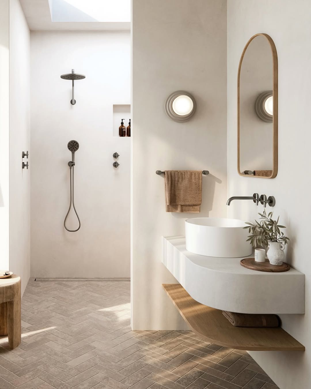
In the bathroom illustrated here, a warm neutral palette connects the wall surfaces, herringbone floor tiles, timber shelf and basin area.
The different textures create variation without introducing an unrelated colour scheme.
The result demonstrates how continuity can be maintained through tone, proportion and material character, even when the construction requirements are different.
A cohesive home should accommodate these functional differences rather than attempting to conceal them.
When Continuity Becomes Monotony
Material continuity should not become a requirement for every finish to match.
Consider a home that uses pale oak throughout.
Oak flooring, oak kitchen cabinetry, oak dining furniture and oak bedroom storage may seem like a simple way to maintain consistency.
But when every surface has similar colour, grain and visual weight, the home can lose contrast.
An alternative might retain oak flooring while introducing painted cabinetry, a darker timber dining table or upholstered furniture with a different tactile quality.
The original material remains present, but the composition becomes more varied.
The same principle applies to stone.
A dramatic stone surface may work best as a focal feature rather than being repeated across every available wall and countertop.
Continuity is strongest when repetition is selective.
A Design Exercise: Three Materials, One Home
Imagine a contemporary home where three material families form the foundation of the design:
Warm oak, pale mineral surfaces and brushed metal.
In the kitchen, oak may appear on cabinet fronts, while a light stone-look benchtop creates a clean working surface.
In the dining area, the timber might return through the table or sideboard, complemented by fabric upholstery.
In the living room, the same warmth could appear through selected furniture, while the larger surfaces remain visually quiet.
In the bathroom, moisture-appropriate mineral finishes could take a more prominent role, accompanied by a vanity with a compatible timber tone.
In the bedroom, the material language might become softer through natural textiles, restrained joinery and warm wall colours.
The rooms are not copies of one another.
Their materials respond to different functions while maintaining an underlying relationship.
This is a hypothetical design scenario, not a fixed material formula. Its purpose is to show how a small number of well-considered material relationships can support varied spaces.
How to Recognise a Cohesive Home
A useful way to assess continuity is to imagine moving through the home without focusing on individual decorative objects.
Look at the floors, walls, fixed joinery and larger furniture pieces.
Notice where materials repeat, where colours change and where transitions occur.
Ask whether those changes feel connected to the architecture and use of each space.
A successful interior does not require every decision to be immediately noticeable.
In fact, some of its most important relationships may be almost invisible.
The floor leads naturally towards the next room.
The cabinetry sits comfortably beside the wall finish.
The furniture introduces variation without disrupting the composition.
The materials feel appropriate to the way each space is used.
The home has a recognisable character, but each room retains its own purpose.
How to Recognise a Cohesive Home
A useful way to assess material continuity is to move through a home without focusing on individual decorative objects.
Look instead at the larger relationships: how the flooring connects adjoining rooms, how timber and stone finishes respond to one another, and how light changes the appearance of materials throughout the day.
Some of these relationships may be immediately noticeable. Others are subtle enough to be felt rather than consciously observed.
A cohesive interior does not require every room to look alike. It needs a recognisable material language that accommodates different functions, moods and experiences.
A Practical Material Continuity Review
Before finalising a renovation or selecting new finishes, it can be helpful to review the home as a connected composition rather than a collection of separate rooms.
The following framework offers six areas of observation. It is not a rigid design formula or scoring system, but a way to identify where materials reinforce one another — and where the relationships may need further consideration.
Design element | What to observe | A question worth asking |
|---|---|---|
Material palette | Timber, stone, metal and textiles across different rooms | Do the finishes share a recognisable relationship without becoming identical? |
Colour undertones | Warm, cool and neutral tones in adjacent surfaces | Do the materials complement one another under the home's actual lighting? |
Visual hierarchy | Expressive patterns, textures and quieter backgrounds | Is there a clear balance between focal materials and supporting surfaces? |
Spatial transitions | Flooring, thresholds, adjoining walls and changes in finish | Do material changes occur at meaningful architectural boundaries? |
Light and atmosphere | The appearance of materials in daylight and artificial light | Does the palette remain visually coherent as lighting conditions change? |
Function and longevity | Moisture exposure, cleaning, wear and everyday use | Is each material appropriate for its location and intended purpose? |
Reading the Results as a Whole
These observations are most useful when considered together.
A home may contain several timber finishes without feeling inconsistent, provided their tones, textures and surrounding materials create a convincing relationship.
Equally, a dramatic stone wall may introduce a strong contrast while still belonging to the wider interior, particularly when the flooring and adjacent surfaces provide visual continuity.
If a transition feels uncomfortable, the solution is not necessarily to replace a material. Adjusting the surrounding colour, introducing a complementary texture or simplifying competing finishes may be enough to restore balance.
The aim is not to eliminate difference.
It is to make each difference feel intentional.
When material continuity is successful, the floor leads naturally towards the next room, the cabinetry sits comfortably beside the wall finish, and the furniture introduces variation without disrupting the composition.
The home develops a recognisable character while allowing each room to retain its own purpose.
Designing the Home, Not Just the Rooms
The most enduring interiors are not necessarily those with the most expensive materials or the most perfectly matched finishes.
They are homes in which individual decisions contribute to a larger idea.
A bathroom can be calm and private. A kitchen can be active and practical. A living room can be relaxed and expressive.
These spaces do not need identical surfaces to belong together.
They need thoughtful relationships.
Material continuity is ultimately about recognising those relationships before the house becomes a collection of isolated design choices.
A beautiful room is one achievement.
A home that feels connected from beginning to end is another.