
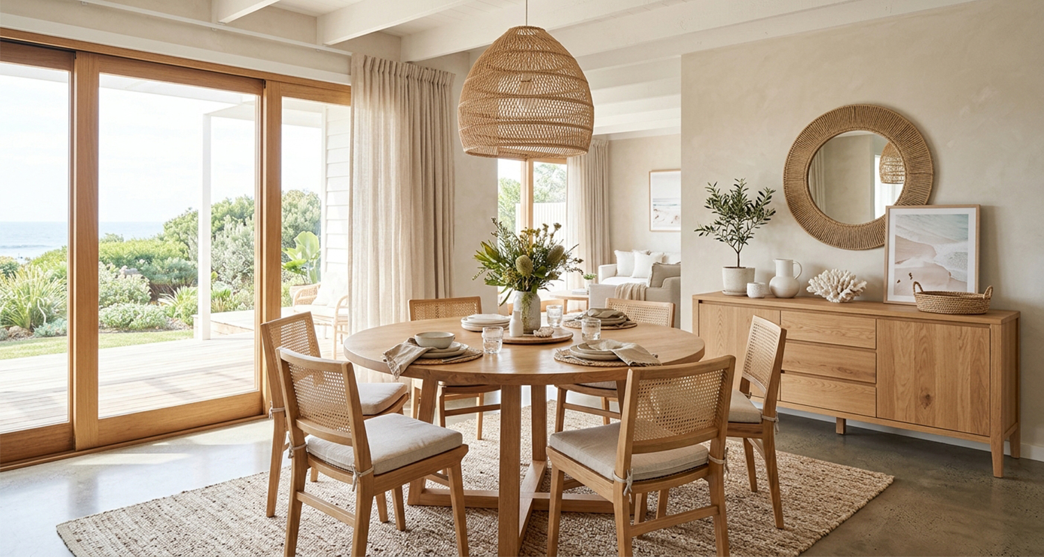
The sideboard is the hardest-working surface in an Australian dining room. By day it holds your favourite ceramics and a lamp or two; when friends come over, it becomes a serving station for the whole night. That double life is exactly why coastal sideboard styling trips so many people up — it has to look curated with almost nothing on it, and still work when it's loaded with plates.
The good news: Australian coastal style is one of the easiest looks to get right, because it's built on a short list of natural materials and a few repeatable arranging tricks. In this guide, we'll cover the four materials that make the look, three styling formulas you can copy tonight, and where to find pieces that do the work for you.
What Is Australian Coastal Style?
Australian coastal style is relaxed by design.
Where Hamptons styling leans formal and nautical themes lean literal, the Australian version is closer to how people actually live near the water: light natural finishes, soft edges, and nothing that demands to be dusted twice a week.
The palette sits close to the beach itself — whites, sand and shell, with soft blue accents layered over a neutral base.
The materials are natural fibres and textures: stone, bamboo, rattan, wicker, jute, hemp and wool all belong, and as long as you stay in the same neutral family, you can mix them freely.
Coastal dining furniture tends toward whitewashed or light natural finishes with relaxed, casual profiles — often with woven or rattan elements and natural-fibre accessories.
A coastal sideboard, then, is less about a specific product and more about a finish and a feeling: pale timber, light-catching surfaces, and styling that leaves room to breathe.
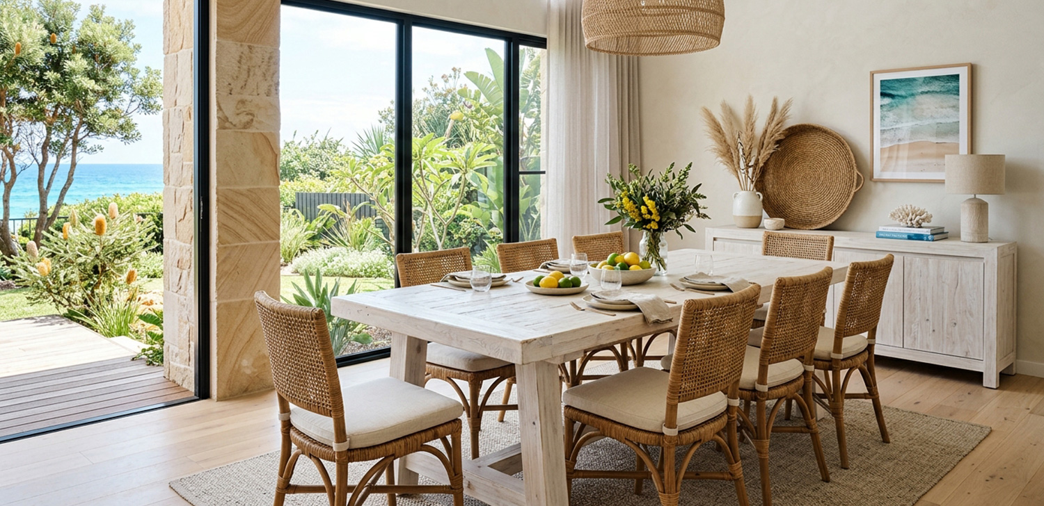
Sideboard or Buffet?
Short answer: not really.
In Australia, "sideboard," "buffet" and even "credenza" are used almost interchangeably, and the same piece of furniture might be labelled differently by two different retailers.
If you want the loose distinctions: a buffet is the name most often used when the piece lives in the dining room and serves food, while a sideboard is the same idea in a living room or hallway.
Some retailers use leg height as the divider — taller legs reads "buffet," shorter legs or a solid base reads "sideboard".
None of it changes how you style the top, which is where the fun is anyway.
Four Coastal Styling Materials
Every good coastal vignette comes down to layering two or three natural materials in different roles.
You don't need all four of the materials below on one sideboard — pick a dominant one, a support, and maybe one accent.
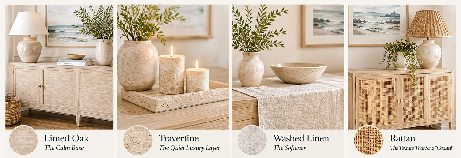
Limed Oak — The Calm Base
Limed oak is the quiet hero of the Australian coastal look.
A limed finish gives timber a pale, washed, sun-bleached appearance — the look that reads instantly "beach house" without shouting about it.
Australian stylists regularly pair a whitewashed buffet even with dark spotted gum flooring, because the contrast between pale furniture and dark floor is a classic coastal move.
On the sideboard itself, limed oak is usually the whole story — the finish is the design.
If your sideboard is already limed oak, let it dominate and keep everything else on top low-key.
If your sideboard is a different finish, limed oak can still join the vignette as a tray or a low bowl that groups smaller objects together.
One starting rule: try not to mix heavy dark timbers like walnut into the same vignette.
The light palette works because everything stays in the same tonal family — if you do mix, let one timber clearly dominate.
Travertine — The Quiet Luxury Layer
Travertine is the stone that made "relaxed luxury" a furniture-store phrase.
Polished marble reads formal; for a sideboard, look for travertine accessories with a honed or matte finish — the softly pitted surface is the relaxed, beach-house-friendly version of the stone. It shows up as trays, cheese boards, candle bases and small sculptural objects.
Its job on a sideboard is to add weight — visually, not literally.
A travertine tray under a group of candles instantly makes the arrangement look deliberate rather than scattered.
It pairs beautifully with limed oak, washed linen and weathered brass.
A good starting rule: two travertine objects is usually enough.
More than that and the stone starts competing with the timber instead of complementing it.
Washed Linen — The Softener
Washed linen is the layer that stops a sideboard looking like a shop display.
Its job is to soften the hard surfaces — timber, stone, ceramics — that make up everything else in the vignette.
The easiest move is a linen runner laid across about one third of the top, positioned under the low group of objects.
It also ties the room together: run the same washed linen on the dining table as a table runner or napkins, and the sideboard and table suddenly read as one scheme.
For a quieter starting point, keep the on-surface linen plain — pattern usually reads calmer on cushions and dining chairs where there's room for it, and you can always introduce a print later if the surface feels flat.
Rattan — The Texture That Says "Coastal"
If limed oak is the base and travertine is the luxury, rattan is the personality.
Woven texture is the single fastest way to make a dining room read coastal — it's the signature material of the look, appearing in sideboard doors, dining chairs, lampshades and baskets.
Rattan works hardest in the furniture itself: rattan-front doors on the sideboard, or a pair of rattan dining chairs in view of it.
If your sideboard is timber, bring rattan in through a woven basket tucked below (excellent hidden storage) or a small woven tray grounding a lamp. A woven basket below the sideboard does double duty as stylish concealed storage and natural texture.
One or two rattan applications per vignette is the sweet spot.
Rattan doors plus a basket plus a lampshade plus a tray tips the look from "coastal" to "beach-themed."
Three Sideboard Styling Formulas
You can rearrange a sideboard top forever and still feel like something's missing — or you can use a formula.
These three work for any sideboard, any room, any budget.
The height ratios here are starting points, not measurements: adjust until the arrangement feels right from where you actually sit.
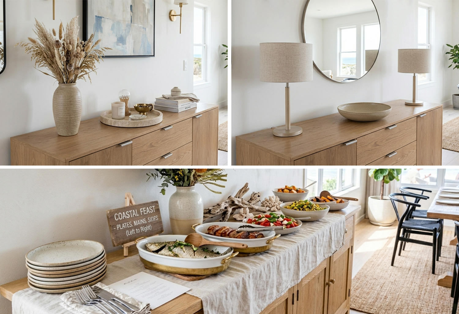
Formula 1: The Rule-of-Three Vignette
The rule of three doesn't mean three objects.
It means three visual groups at three height levels — which is why stylists keep recommending odd-number groupings with varied heights and breathing room between them.
Here's the setup:
The tall anchor (back, one side).
One tall object — a lamp, a tall ceramic vase with a single branch of eucalyptus, or a framed print leaning against the wall. It should stand noticeably taller than everything else on the top.
The medium focal (front, opposite third).
The object the eye lands on: a travertine tray with candles, a sculptural bowl, a cluster of three ceramics.
The low grounding group (remaining space).
Books stacked horizontally, a small woven tray, a low bowl.
These sit closest to the surface and pull the whole arrangement down to earth.
The height contrast is the whole trick — a flat skyline of same-height objects reads as clutter, while a "high, medium, low" arrangement reads as curated.
And leave space: as a starting point, aim for about a third of the surface clear.
As a worked example, on a 1500–1800mm buffet that means three groups with clear gaps between them, and taller pieces toward the back so nothing hides.
Formula 2: Lamps and a Mirror — The Height-Balance Classic
This is the most reliable dining-room sideboard arrangement in existence, because it solves height, light and symmetry in one move.
Twin lamps at each end.
Matching lamps create instant symmetry and give you soft evening light for dinner — Australian retailers recommend lamps or decorative lighting on buffets exactly for this ambience.
Choose linen or washed-cotton shades to keep the coastal texture story going, and check the base suits the depth of your top.
A large round mirror centred above.
A mirror above the buffet reflects natural light and makes the room feel bigger and brighter — a genuine advantage in Australian dining rooms that borrow light from elsewhere. A good starting proportion is to size the mirror to roughly two-thirds the width of the buffet.
To hang it, measure first, then test.
Cut a paper template to the mirror's size, tape it to the wall, and check the arrangement from where you sit at the dining table, then from standing.
Adjust the gap between mirror and lamps until the pieces feel connected and the lampshades don't block the reflection.
Keep the middle low.
One low bowl or tray between the lamps, and nothing mid-height.
That empty middle zone is what creates the calm, gallery-like balance this formula is known for.
Formula 3: The Entertaining Setup
When guests are coming, the sideboard stops being a display and starts being a serving station.
The styling doesn't disappear — it gets out of the way.
Start from a clean slate.
Take everything off the top, then bring back only the lamps (or one tall item at each end) and clear the centre.
Stripping the surface completely before you restyle — the "clean slate" technique — is a suggested way to begin, not a ceremony.
Set up a left-to-right serving flow.
Plates first, then mains, then sides and condiments, with cutlery and napkins at the end — so guests always have one hand free while they serve themselves.
Heavy, stable dishes stay low; anything tall goes at the back of the surface so sightlines across the buffet stay clear.
Protect the surface.
A washed linen runner sets the serving zone, and coasters and placemats shield the finish from spills — follow your furniture manufacturer's care instructions for the specific finish.
Wall Styling Above the Sideboard
The wall behind your sideboard is part of the vignette — leaving it bare is one option, but used well, it draws the eye upward and makes the room read larger.
Three options, in order of effort:
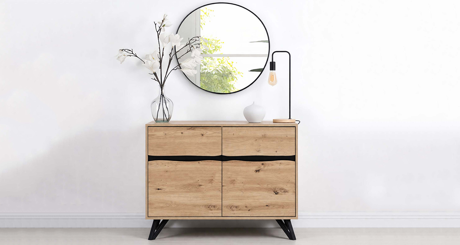
A round mirror.
The classic pairing with the lamp formula above — reflection, light, softness in one, you can explore the set in LivaraHome.
One large artwork.
A single framed print or photograph, beach-adjacent in palette.
One Australian beach house look that works well: a photographic print hung above a weathered-timber sideboard, echoed by coral, books and a candle on the surface below.
A small gallery wall.
Several smaller frames grouped above the sideboard.
This works best when the objects below are minimal, so the two zones don't compete.
Whichever you choose, scale matters: a good starting point is a wall piece roughly two-thirds the width of the buffet below it.
A tiny print above a wide sideboard looks lost; something too large swallows the lamps.
Styling Ideas by Room Vibe
Same materials, three different moods. Pick the one that matches how you actually live.
Barefoot luxe.
A limed oak sideboard, twin linen-shaded lamps, a travertine tray with cream candles, and a brass or weathered-brass accent for warmth.
This is the grown-up coastal look — quiet, expensive-feeling, and almost monochrome. Keep the colour count low and let the materials do the talking.
Relaxed family.
A rattan-front sideboard with a washed linen runner, ceramic vases holding banksia or eucalyptus stems, and a woven basket below for the things that never seem to have a home.
Native stems like banksia and bottlebrush are the most Australian touch you can add. This look is built to be touched, used and slightly imperfect.
Modern minimal.
A limed oak sideboard with almost nothing on it: one large ceramic or travertine object, a horizontal stack of two or three books, done.
The restrained side of coastal — one striking piece rather than a cluster — is a legitimate styling choice, not laziness.
Five Coastal Styling Mistakes to Avoid
Over-theming. Shells, coral and driftwood on every surface reads costume, not coastal. One found object, used once, is plenty.
Too many small objects. Ten little things will always look like clutter. Aim for three groups at three heights, with about a third of the surface left clear.
Matching everything. Matching lamps can give a scheme structure — the risk is when the vases, trays and frames all match too. Stay in the palette, vary the shapes.
Ignoring the wall. A styled top against a bare wall can feel like half a job. Mirror, art or gallery — consider one.
Going too dark or heavy. Chunky dark furniture fights the light palette this look depends on. If you have one dark piece, make it the deliberate exception.
Frequently Asked Questions
What's the difference between a sideboard and a buffet in Australia?
In practice, nothing — Australian retailers use the terms interchangeably. The loose convention is that "buffet" describes the piece in a dining room and "sideboard" the same piece in a living room or hallway.
What height should a sideboard be?
One Australian retailer cites 800–900mm as a comfortable serving height for standard dining rooms — a useful starting range rather than a rule. The practical test: it should be easy to set a plate down on without bending.
How wide should a sideboard be?
The same retailer cites 1200–2400mm as the workable range for typical Australian dining rooms. Measure your wall and the walking space around your dining table rather than relying on fixed numbers.
How do I style a sideboard without it looking cluttered?
Three groups, three heights, and roughly a third of the surface left clear — as a starting point. If you have to move something to set a glass down, restyle.
Can I put lamps on a sideboard?
Yes — twin lamps at each end is the classic dining-room arrangement, giving you symmetry by day and soft light by night.